10. Unsupervised Learning
No labeled responses, the goal is to capture interesting structure or information.
- Applications include:
- Visualise structure of a complex dataset
- Density estimations to predict probabilities of events
- Compress and summarise the data
- Extract features for supervised learning
- Discover important clusters or outliers
10.1. Transformations
Processes that extract or compute information.
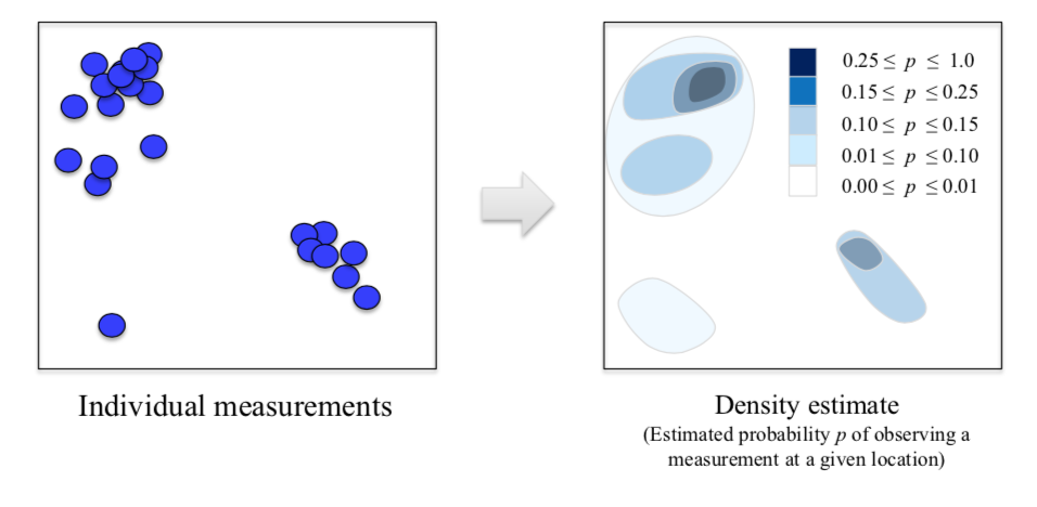
10.1.1. Kernel Density Estimation
University of Michigan: Coursera Data Science in Python
10.1.2. Dimensionality Reduction
- Curse of Dimensionality: Very hard to visualise with many dimensions
- Finds an approximate version of your dataset using fewer features
- Used for exploring and visualizing a dataset to understand grouping or relationships
- Often visualized using a 2-dimensional scatterplot
- Also used for compression, finding features for supervised learning
- Can be classified into linear (PCA), or non-linear (manifold) reduction techniques
10.1.2.1. Principal Component Analysis
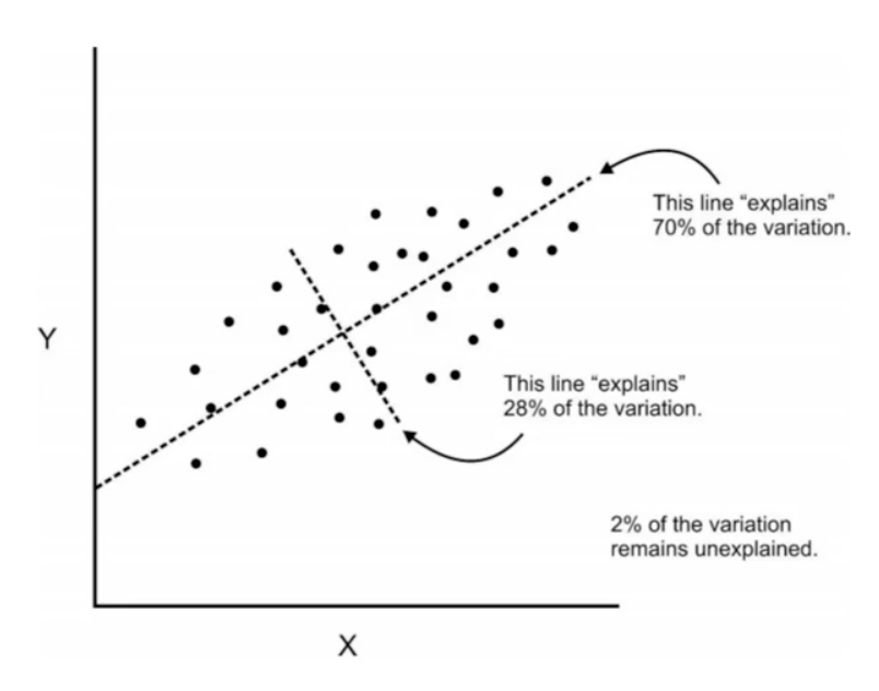
PCA summarises multiple fields of data into principal components, usually just 2 so that it is easier to visualise in a 2-dimensional plot. The 1st component will show the most variance of the entire dataset in the hyperplane, while the 2nd shows the 2nd shows the most variance at a right angle to the 1st. Because of the strong variance between data points, patterns tend to be teased out from a high dimension to even when there’s just two dimensions. These 2 components can serve as new features for a supervised analysis.
In short, PCA finds the best possible characteristics, that summarises the classes of a feature. Two excellent sites elaborate more: setosa, quora. The most challenging part of PCA is interpreting the components.
from sklearn.preprocessing import StandardScaler
from sklearn.decomposition import PCA
from sklearn.datasets import load_breast_cancer

cancer = load_breast_cancer()
df = pd.DataFrame(cancer['data'],columns=cancer['feature_names'])

# Before applying PCA, each feature should be centered (zero mean) and with unit variance
scaled_data = StandardScaler().fit(df).transform(df)

pca = PCA(n_components = 2).fit(scaled_data)
# PCA(copy=True, n_components=2, whiten=False)

x_pca = pca.transform(scaled_data)
print(df.shape, x_pca.shape)

# RESULTS
(569, 30) (569, 2)
To see how much variance is preserved for each dataset.
percent = pca.explained_variance_ratio_
print(percent)
print(sum(percent))

# [0.9246348, 0.05238923] 1st component explained variance of 92%, 2nd explained 5%
# 0.986 total variance explained from 2 components is 97%
Alteratively, we can write a function to determine how much components we should reduce it by.
def pca_explained(X, threshold):
    '''
    prints optimal principal components based on threshold of PCA's explained variance

    Parameters
    ----------
    X : dataframe or array
        of features
    threshold : float < 1
        percentage of explained variance as cut off point
    '''

    # find total no. of features
    features = X.shape[1]
    # iterate till total no. of features,
    # and find total explained variance for each principal component
    for i in range(2, features):
        pca = PCA(n_components = i).fit(X)
        sum_ = pca.explained_variance_ratio_
        # add all components explained variances
        percent = sum(sum_)
        print('{} components at {:.2f}% explained variance'.format(i, percent*100))
        if percent > threshold:
            break

pca_explained(X, 0.85)
# 2 components at 61.64% explained variance
# 3 components at 77.41% explained variance
# 4 components at 86.63% explained variance
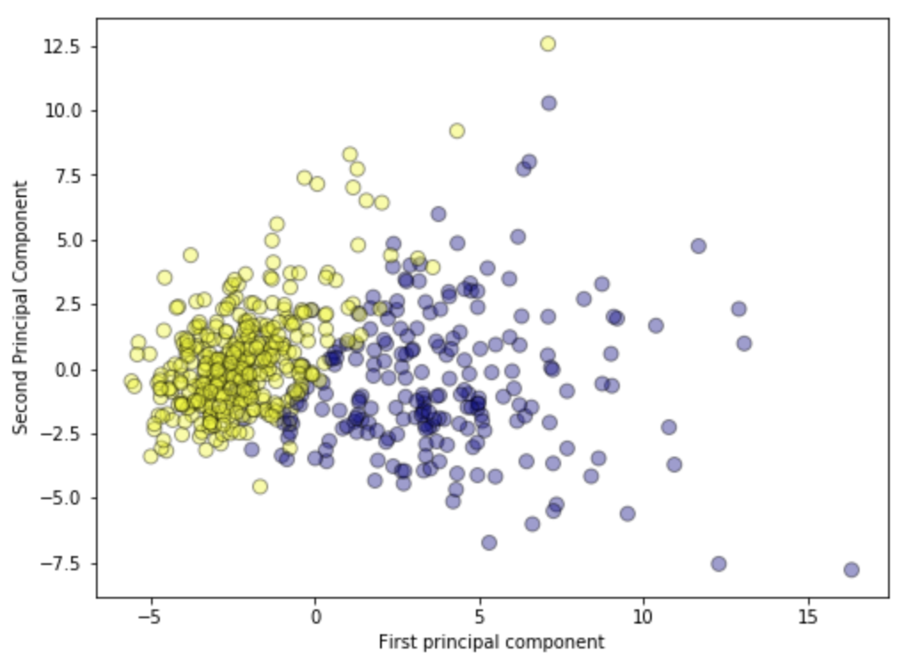
Plotting the PCA-transformed version of the breast cancer dataset. We can see that malignant and benign cells cluster between two groups and can apply a linear classifier to this two dimensional representation of the dataset.
plt.figure(figsize=(8,6))
plt.scatter(x_pca[:,0], x_pca[:,1], c=cancer['target'], cmap='plasma', alpha=0.4, edgecolors='black', s=65);
plt.xlabel('First Principal Component')
plt.ylabel('Second Principal Component')
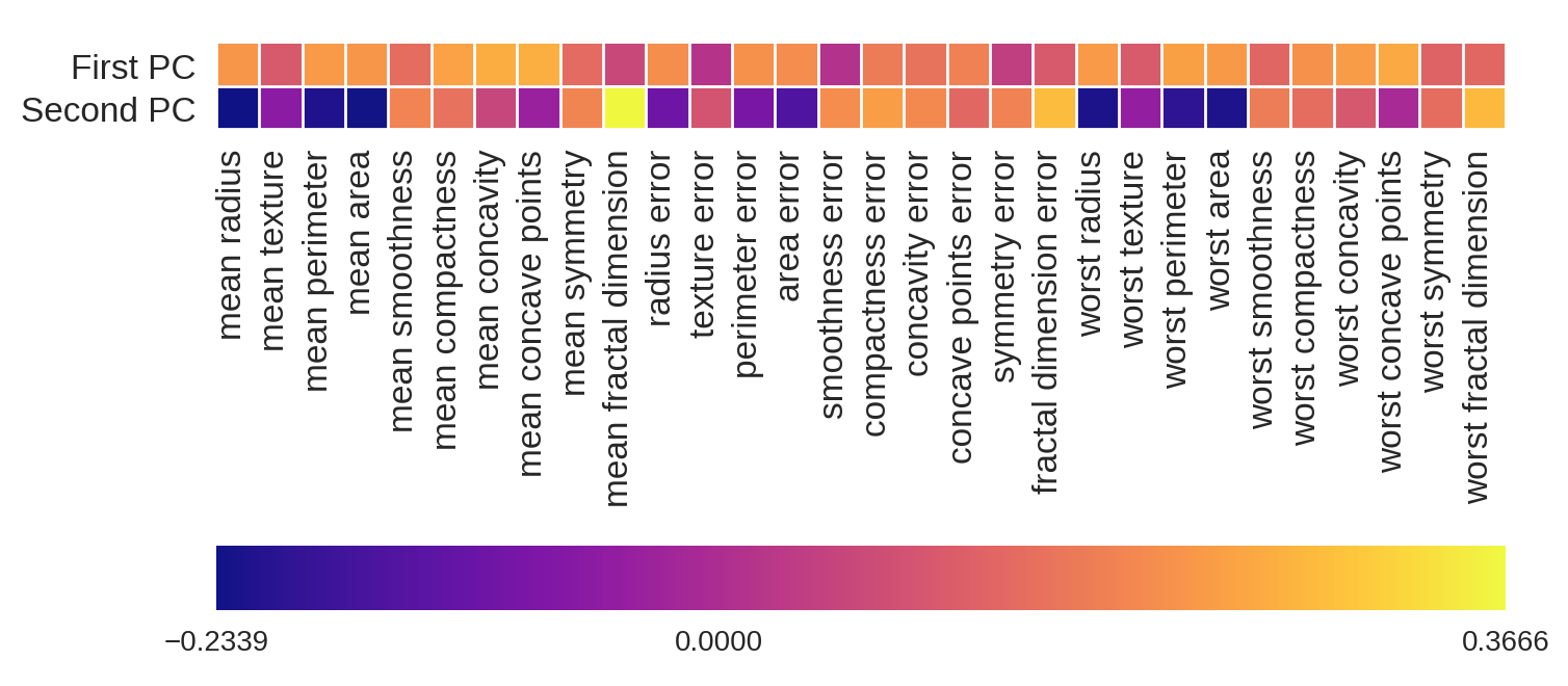
Plotting the magnitude of each feature value for the first two principal components. This gives the best explanation for the components for each field.
fig = plt.figure(figsize=(8, 4))
plt.imshow(pca.components_, interpolation = 'none', cmap = 'plasma')
feature_names = list(cancer.feature_names)

plt.gca().set_xticks(np.arange(-.5, len(feature_names)));
plt.gca().set_yticks(np.arange(0.5, 2));
plt.gca().set_xticklabels(feature_names, rotation=90, ha='left', fontsize=12);
plt.gca().set_yticklabels(['First PC', 'Second PC'], va='bottom', fontsize=12);

plt.colorbar(orientation='horizontal', ticks=[pca.components_.min(), 0,
                                              pca.components_.max()], pad=0.65);
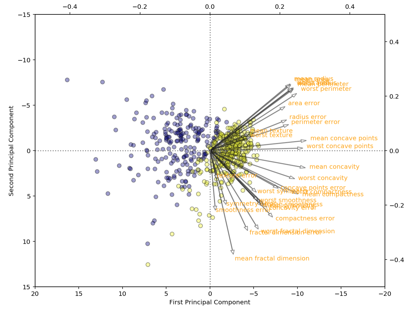
We can also plot the feature magnitudes in the scatterplot like in R into two separate axes, also known as a biplot. This shows the relationship of each feature’s magnitude clearer in a 2D space.
# put feature values into dataframe
components = pd.DataFrame(pca.components_.T, index=df.columns, columns=['PCA1','PCA2'])

# plot size
plt.figure(figsize=(10,8))

# main scatterplot
plt.scatter(x_pca[:,0], x_pca[:,1], c=cancer['target'], cmap='plasma', alpha=0.4, edgecolors='black', s=40);
plt.xlabel('First Principal Component')
plt.ylabel('Second Principal Component')
plt.ylim(15,-15);
plt.xlim(20,-20);

# individual feature values
ax2 = plt.twinx().twiny();
ax2.set_ylim(-0.5,0.5);
ax2.set_xlim(-0.5,0.5);

# reference lines
ax2.hlines(0,-0.5,0.5, linestyles='dotted', colors='grey')
ax2.vlines(0,-0.5,0.5, linestyles='dotted', colors='grey')

# offset for labels
offset = 1.07

# arrow & text
for a, i in enumerate(components.index):
    ax2.arrow(0, 0, components['PCA1'][a], -components['PCA2'][a], \
            alpha=0.5, facecolor='white', head_width=.01)
    ax2.annotate(i, (components['PCA1'][a]*offset, -components['PCA2'][a]*offset), color='orange')
Lastly, we can specify the percentage explained variance, and let PCA decide on the number components.
from sklearn.decomposition import PCA
pca = PCA(0.99)
df_pca = pca.fit_transform(df)

# check no. of resulting features
df_pca.shape
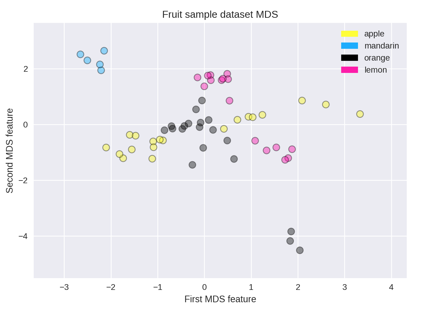
10.1.2.2. Multi-Dimensional Scaling
Multi-Dimensional Scaling (MDS) is a type of manifold learning algorithm that to visualize a high dimensional dataset and project it onto a lower dimensional space - in most cases, a two-dimensional page. PCA is weak in this aspect.
sklearn gives a good overview of various manifold techniques. https://scikit-learn.org/stable/modules/manifold.html
from adspy_shared_utilities import plot_labelled_scatter
from sklearn.preprocessing import StandardScaler
from sklearn.manifold import MDS

# each feature should be centered (zero mean) and with unit variance
X_fruits_normalized = StandardScaler().fit(X_fruits).transform(X_fruits)

mds = MDS(n_components = 2)

X_fruits_mds = mds.fit_transform(X_fruits_normalized)

plot_labelled_scatter(X_fruits_mds, y_fruits, ['apple', 'mandarin', 'orange', 'lemon'])
plt.xlabel('First MDS feature')
plt.ylabel('Second MDS feature')
plt.title('Fruit sample dataset MDS');
10.1.2.3. t-SNE
t-Distributed Stochastic Neighbor Embedding (t-SNE) is a powerful manifold learning algorithm for visualizing clusters. It finds a two-dimensional representation of your data, such that the distances between points in the 2D scatterplot match as closely as possible the distances between the same points in the original high dimensional dataset. In particular, t-SNE gives much more weight to preserving information about distances between points that are neighbors.
More information here.
from sklearn.manifold import TSNE

tsne = TSNE(random_state = 0)

X_tsne = tsne.fit_transform(X_fruits_normalized)

plot_labelled_scatter(X_tsne, y_fruits,
    ['apple', 'mandarin', 'orange', 'lemon'])
plt.xlabel('First t-SNE feature')
plt.ylabel('Second t-SNE feature')
plt.title('Fruits dataset t-SNE');
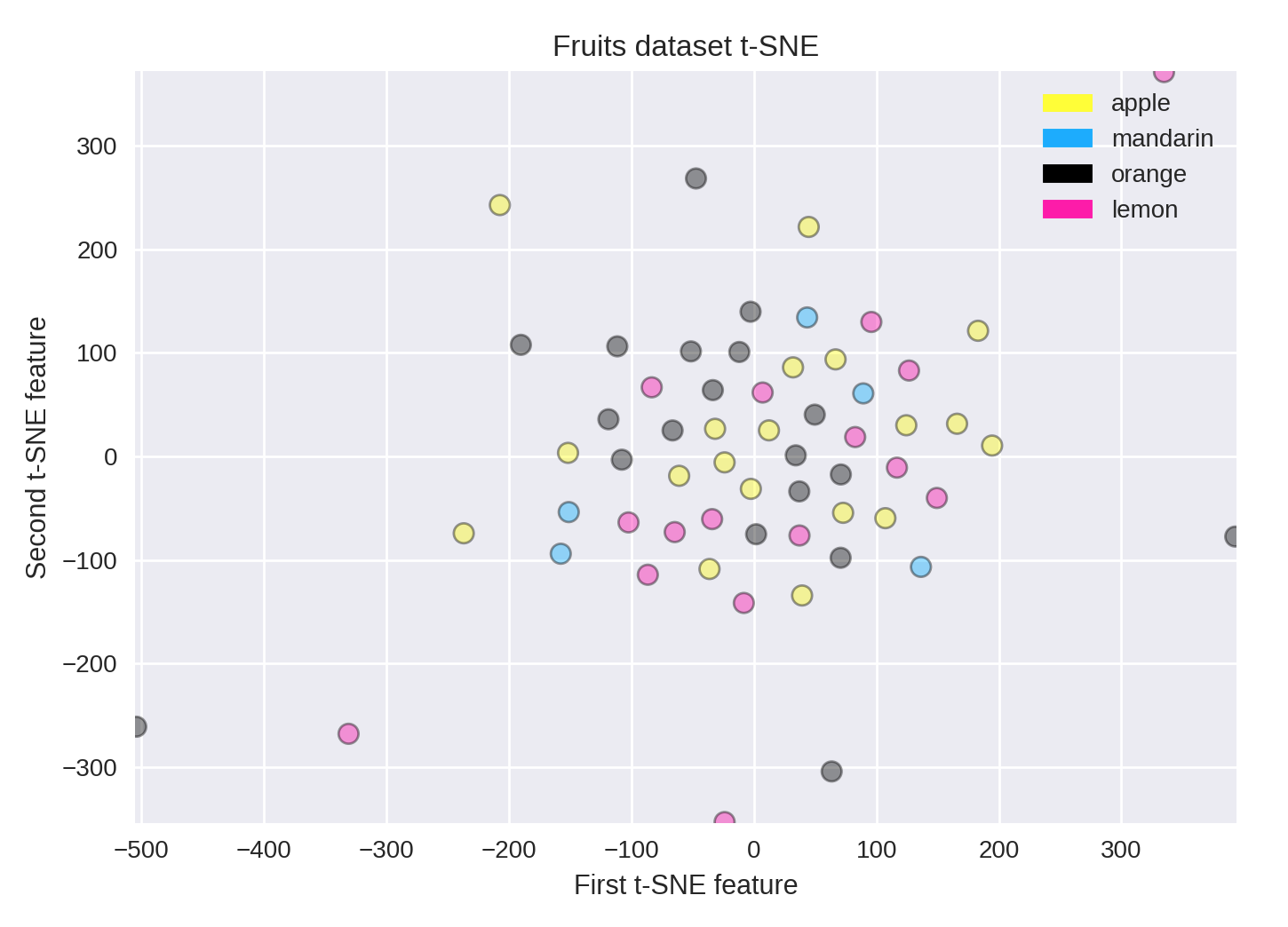
You can see how some dimensionality reduction methods may be less successful on some datasets. Here, it doesn’t work as well at finding structure in the small fruits dataset, compared to other methods like MDS.
10.1.2.4. LDA
Latent Dirichlet Allocation is another dimension reduction method, but unlike PCA, it is a supervised method. It attempts to find a feature subspace or decision boundary that maximizes class separability. It then projects the data points to new dimensions in a way that the clusters are as separate from each other as possible and the individual elements within a cluster are as close to the centroid of the cluster as possible.
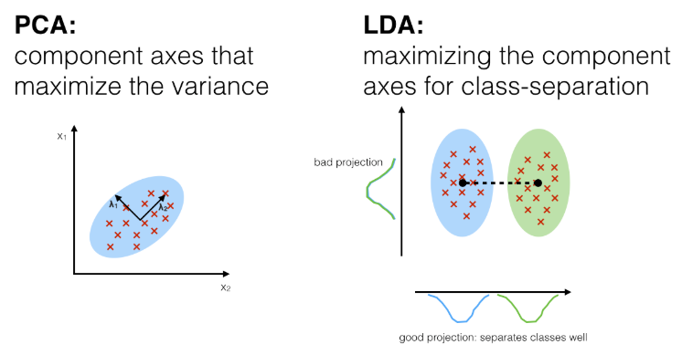
- Differences of PCA & LDA, from:
# from sklearn documentation
from sklearn.decomposition import LatentDirichletAllocation
from sklearn.datasets import make_multilabel_classification

# This produces a feature matrix of token counts, similar to what
# CountVectorizer would produce on text.
X, _ = make_multilabel_classification(random_state=0)
lda = LatentDirichletAllocation(n_components=5, random_state=0)
X_lda = lda.fit_transform(X, y)

# check the explained variance
percent = lda.explained_variance_ratio_
print(percent)
print(sum(percent))
10.1.2.5. Self-Organzing Maps
SOM is a special type of neural network that is trained using unsupervised learning to produce a two-dimensional map. Each row of data is assigned to its Best Matching Unit (BMU) neuron. Neighbourhood effect to create a topographic map
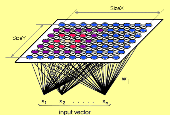
- They differ from other artificial neural networks as:
- they apply competitive learning as opposed to error-correction learning (such as backpropagation with gradient descent)
- in the sense that they use a neighborhood function to preserve the topological properties of the input space.
- Consist of only one visible output layer
Requires scaling or normalization of all features first.
https://github.com/JustGlowing/minisom
We first need to calculate the number of neurons and how many of them making up each side. The ratio of the side lengths of the map is approximately the ratio of the two largest eigenvalues of the training data’s covariance matrix.
# total no. of neurons required
total_neurons = 5*sqrt(normal.shape[1])

# calculate eigen_values
normal_cov = np.cov(data_normal)
eigen_values = np.linalg.eigvals(normal_cov)

# 2 largest eigenvalues
result = sorted([i.real for i in eigen_values])[-2:]
ratio_2_largest_eigen = result[1]/result[0]

side = total_neurons/ratio_2_largest_eigen

# two sides
print(total_neurons)
print('1st side', side)
print('2nd side', ratio_2_largest_eigen)
Then we build the model.
# 1st side, 2nd side, # features
model = MiniSom(5, 4, 66, sigma=1.5, learning_rate=0.5,
              neighborhood_function='gaussian', random_seed=10)

# initialise weights to the map
model.pca_weights_init(data_normal)
# train the model
model.train_batch(df, 60000, verbose=True)
Plot out the map.
plt.figure(figsize=(6, 5))
plt.pcolor(som.distance_map().T, cmap='bone_r')
Quantization error is the distance between each vector and the BMU.
som.quantization_error(array)
10.2. Clustering
Find groups in data & assign every point in the dataset to one of the groups.
The below set of codes allows assignment of each cluster to their original cluster attributes, or further comparison of the accuracy of prediction. The more a cluster is assigned to a verified label, the higher chance it is that label.
# concat actual & predicted clusters together
y = pd.DataFrame(y.values, columns=['actual'])
cluster = pd.DataFrame(kmeans.labels_, columns=['cluster'])
df = pd.concat([y,cluster], axis=1)

# view absolute numbers
res = df.groupby('actual')['cluster'].value_counts()
print(res)

# view percentages
res2 = df.groupby('actual')['cluster'].value_counts(normalize=True)*100
print(res2)
10.2.1. K-Means
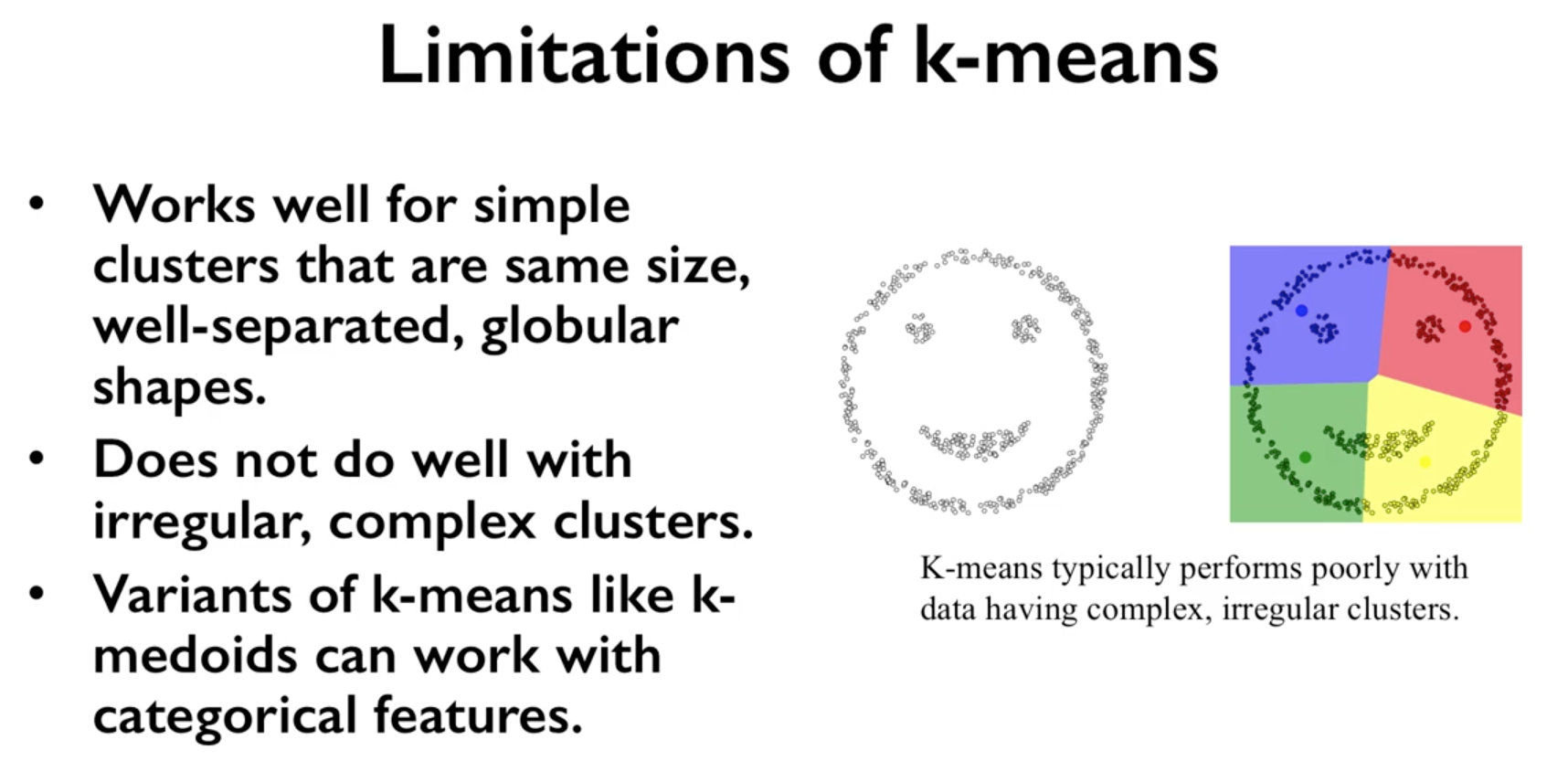
Need to specify K number of clusters. It is also important to scale the features before applying K-means, unless the fields are not meant to be scaled, like distances. Categorical data is not appropriate as clustering calculated using euclidean distance (means). For long distances over an lat/long coordinates, they need to be projected to a flat surface.
One aspect of k means is that different random starting points for the cluster centers often result in very different clustering solutions. So typically, the k-means algorithm is run in scikit-learn with ten different random initializations and the solution occurring the most number of times is chosen.
- Downsides
- Very sensitive to outliers. They have to be removed before running the model
- Might need to reduce dimensions if very high no. of features or the distance separation might not be obvious
- Two variants, K-medians & K-Medoids are less sensitive to outliers (see https://github.com/annoviko/pyclustering)
Introduction to Machine Learning with Python
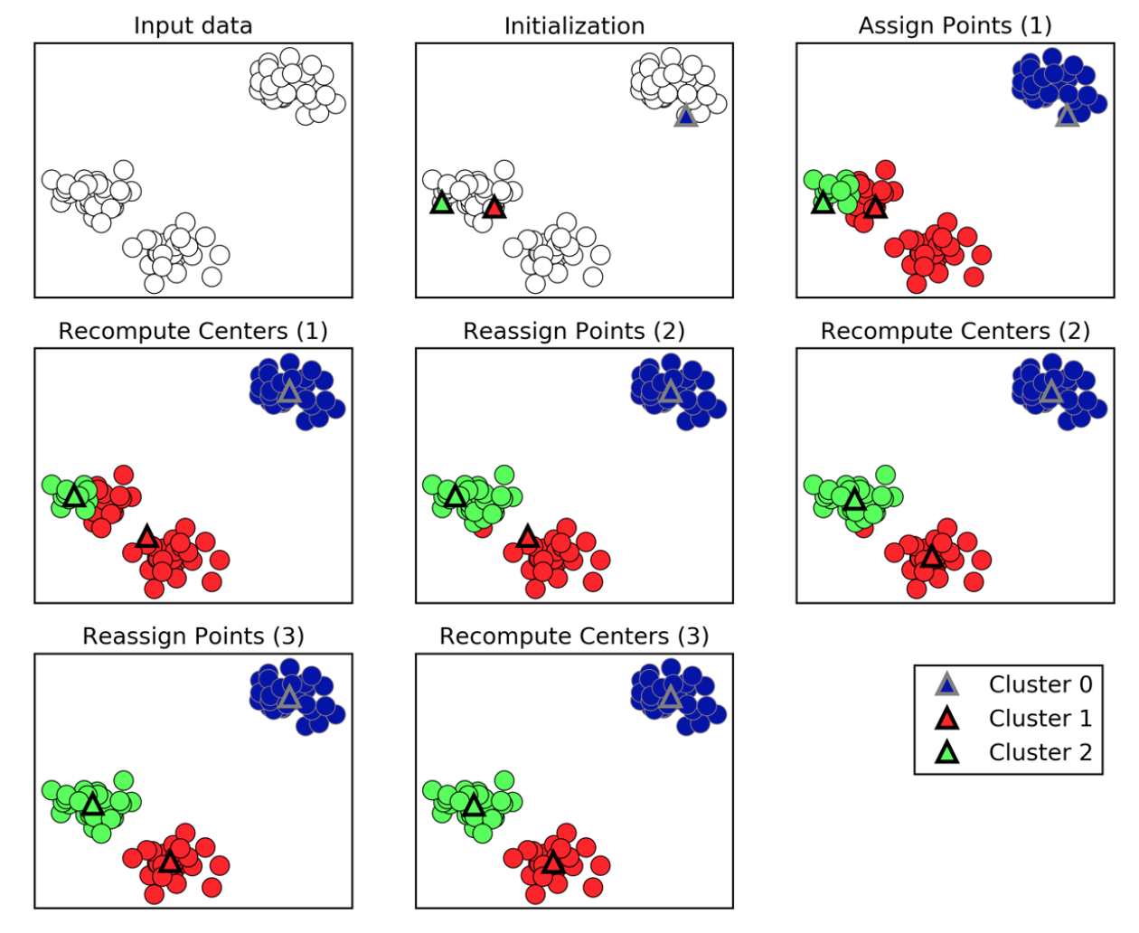
- Methodology
- Specify number of clusters (3)
- 3 random data points are randomly selected as cluster centers
- Each data point is assigned to the cluster center it is cloest to
- Cluster centers are updated to the mean of the assigned points
- Steps 3-4 are repeated, till cluster centers remain unchanged
University of Michigan: Coursera Data Science in Python
Example 1
from sklearn.datasets import make_blobs
from sklearn.cluster import KMeans
from adspy_shared_utilities import plot_labelled_scatter
from sklearn.preprocessing import MinMaxScaler
fruits = pd.read_table('fruit_data_with_colors.txt')
X_fruits = fruits[['mass','width','height', 'color_score']].as_matrix()
y_fruits = fruits[['fruit_label']] - 1
X_fruits_normalized = MinMaxScaler().fit(X_fruits).transform(X_fruits)
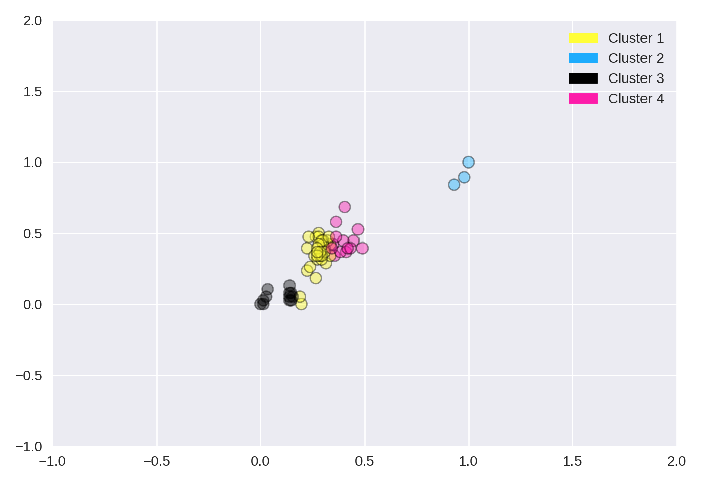
kmeans = KMeans(n_clusters = 4, random_state = 0)
kmeans.fit(X_fruits)
plot_labelled_scatter(X_fruits_normalized, kmeans.labels_,
['Cluster 1', 'Cluster 2', 'Cluster 3', 'Cluster 4'])
Example 2
#### IMPORT MODULES ####
import pandas as pd
from sklearn import preprocessing
from sklearn.cross_validation import train_test_split
from sklearn.cluster import KMeans
from sklearn.datasets import load_iris
#### NORMALIZATION ####
# standardise the means to 0 and standard error to 1
for i in df.columns[:-2]: # df.columns[:-1] = dataframe for all features, minus target
df[i] = preprocessing.scale(df[i].astype('float64'))
df.describe()
#### TRAIN-TEST SPLIT ####
train_feature, test_feature = train_test_split(feature, random_state=123, test_size=0.2)
print train_feature.shape
print test_feature.shape
(120, 4)
(30, 4)
#### A LOOK AT THE MODEL ####
KMeans(n_clusters=2)
KMeans(copy_x=True, init='k-means++', max_iter=300, n_clusters=2, n_init=10,
n_jobs=1, precompute_distances='auto', random_state=None, tol=0.0001,
verbose=0)
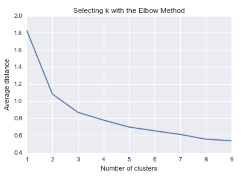
#### ELBOW CHART TO DETERMINE OPTIMUM K ####
from scipy.spatial.distance import cdist
import numpy as np
clusters=range(1,10)
# to store average distance values for each cluster from 1-9
meandist=[]
# k-means cluster analysis for 9 clusters
for k in clusters:
# prepare the model
model=KMeans(n_clusters=k)
# fit the model
model.fit(train_feature)
# test the model
clusassign=model.predict(train_feature)
# gives average distance values for each cluster solution
# cdist calculates distance of each two points from centriod
# get the min distance (where point is placed in clsuter)
# get average distance by summing & dividing by total number of samples
meandist.append(sum(np.min(cdist(train_feature, model.cluster_centers_, 'euclidean'), axis=1))
/ train_feature.shape[0])
import matplotlib.pylab as plt
import seaborn as sns
%matplotlib inline
"""Plot average distance from observations from the cluster centroid
to use the Elbow Method to identify number of clusters to choose"""
plt.plot(clusters, meandist)
plt.xlabel('Number of clusters')
plt.ylabel('Average distance')
plt.title('Selecting k with the Elbow Method')
# look a bend in the elbow that kind of shows where
# the average distance value might be leveling off such that adding more clusters
# doesn't decrease the average distance as much
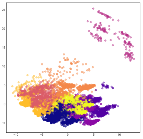
We can visualise the clusters by reducing the dimensions into 2 using PCA. They are separate by theissen polygons, though at a multi-dimensional space.
pca = PCA(n_components = 2).fit(df).transform(df)
labels = kmeans.labels_

plt.figure(figsize=(8,8))
plt.scatter(pd.DataFrame(pca)[0],pd.DataFrame(pca)[1], c=labels, cmap='plasma', alpha=0.5);
Sometimes we need to find the cluster centres so that we can get an absolute distance measure of centroids to new data. Each feature will have a defined centre for each cluster.
# get cluster centres
centroids = model.cluster_centers_
# for each row, define cluster centre
centroid_labels = [centroids[i] for i in model.labels_]
If we have labels or y, and want to determine which y belongs to which cluster for an evaluation score, we can use a groupby to find the most number of labels that fall in a cluster and manually label them as such.
df = concat.groupby(['label','cluster'])['cluster'].count()
If we want to know what is the distance of each datapoint’s assign cluster distance to their centroid, we can do a fit_transform
to get all distance from all cluster centroids and process from there.
from sklearn.cluster import KMeans

kmeans = KMeans(n_clusters=n_clusters, random_state=0)

# get distance from each centroid for each datapoint
dist_each_centroid = kmeans.fit_transform(df)
# get all assigned centroids
y = kmeans.labels_
# get distance of assigned centroid
dist = [distance[label] for label, distance in zip(y, dist_each_centroid)]
# concat label & distance together
label_dist = pd.DataFrame(zip(y,dist), columns=['label','distance'])
10.2.2. Gaussian Mixture Model
GMM is, in essence a density estimation model but can function like clustering. It has a probabilistic model under the hood so it returns a matrix of probabilities belonging to each cluster for each data point. More: https://jakevdp.github.io/PythonDataScienceHandbook/05.12-gaussian-mixtures.html
We can input the covariance_type argument such that it can choose between diag (the default, ellipse constrained to the axes), spherical (like k-means), or full (ellipse without a specific orientation).
from sklearn.mixture import GaussianMixture

# gmm accepts input as array, so have to convert dataframe to numpy
input_gmm = normal.values

gmm = GaussianMixture(n_components=4, covariance_type='full', random_state=42)
gmm.fit(input_gmm)
result = gmm.predict(test_set)
from Python Data Science Handbook by Jake VanderPlas
BIC or AIC are used to determine the optimal number of clusters using the elbow diagram, the former usually recommends a simpler model. Note that number of clusters or components measures how well GMM works as a density estimator, not as a clustering algorithm.
from sklearn.mixture import GaussianMixture
import matplotlib.pyplot as plt
%matplotlib inline
%config InlineBackend.figure_format = 'retina'

input_gmm = normal.values

bic_list = []
aic_list = []
ranges = range(1,30)

for i in ranges:
    gmm = GaussianMixture(n_components=i).fit(input_gmm)
    # BIC
    bic = gmm.bic(input_gmm)
    bic_list.append(bic)
    # AIC
    aic = gmm.aic(input_gmm)
    aic_list.append(aic)

plt.figure(figsize=(10, 5))
plt.plot(ranges, bic_list, label='BIC');
plt.plot(ranges, aic_list, label='AIC');
plt.legend(loc='best');
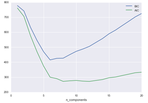
from Python Data Science Handbook by Jake VanderPlas
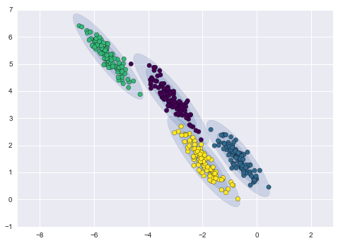
10.2.3. Agglomerative Clustering
Agglomerative Clustering is a type of hierarchical clustering technique used to build clusters from bottom up. Divisive Clustering is the opposite method of building clusters from top down, which is not available in sklearn.
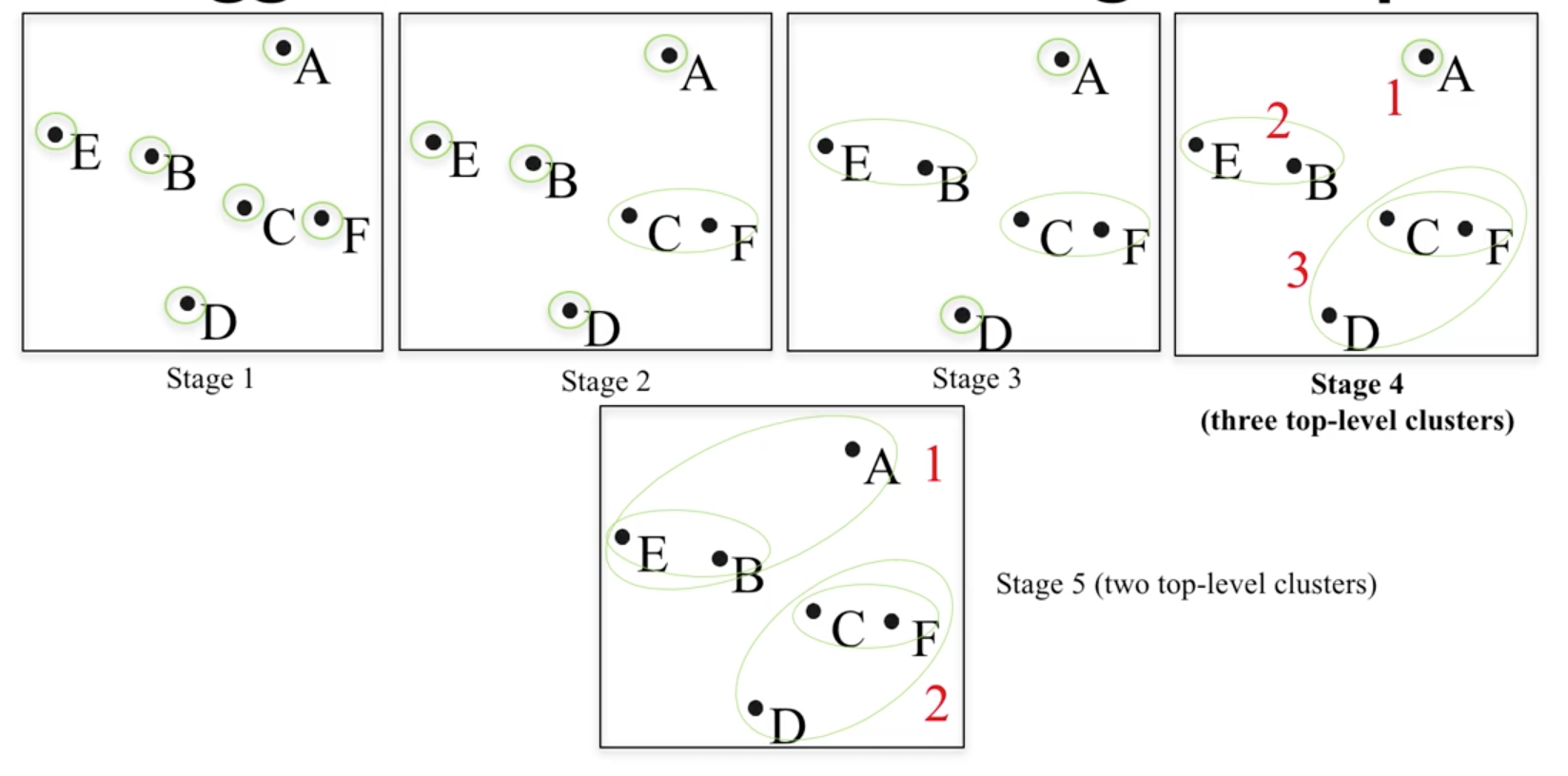
University of Michigan: Coursera Data Science in Python
Methods of linking clusters together.
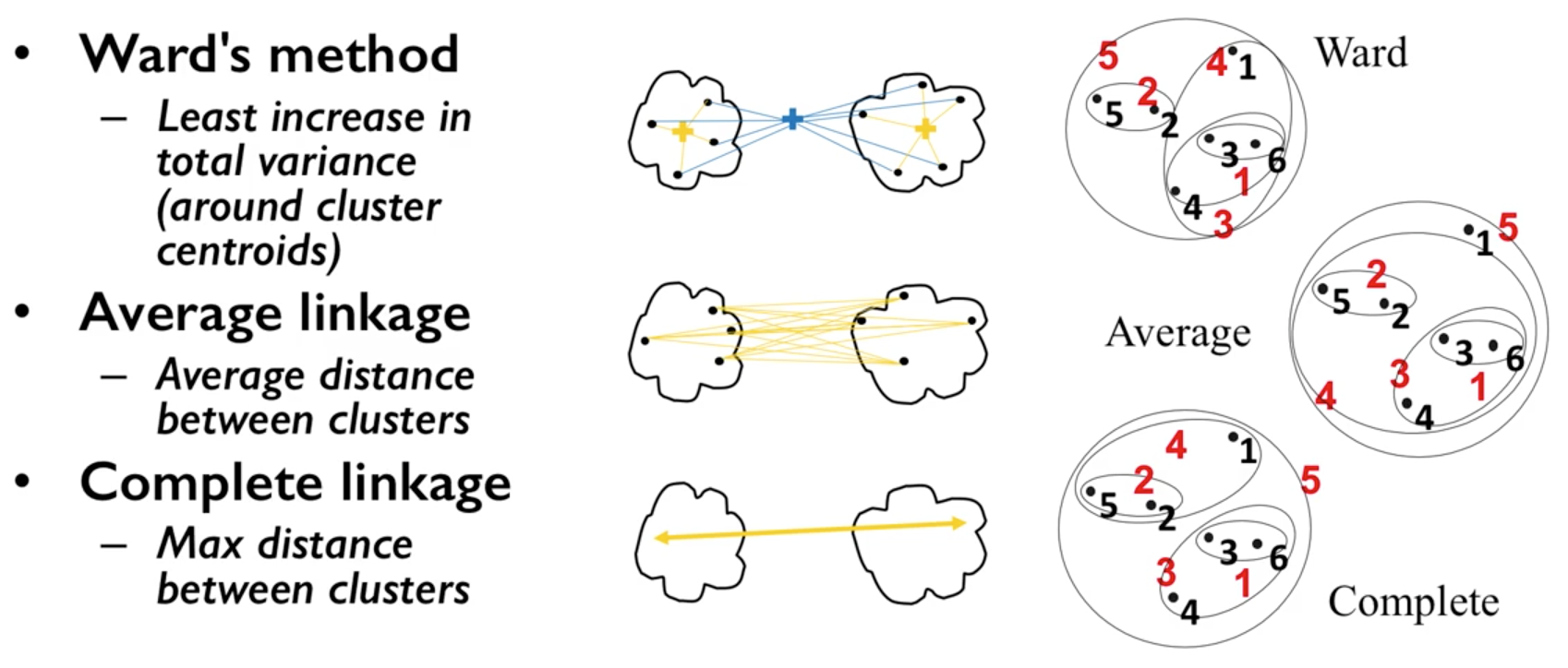
University of Michigan: Coursera Data Science in Python
AgglomerativeClustering method in sklearn allows clustering to be choosen by the no. clusters or distance threshold.
from sklearn.datasets import make_blobs
from sklearn.cluster import AgglomerativeClustering

X, y = make_blobs(random_state = 10)

# n_clusters must be None if distance_threshold is not None
cls = AgglomerativeClustering(n_clusters = 3, affinity=’euclidean’, linkage=’ward’, distance_threshold=None)
cls_assignment = cls.fit_predict(X)
One of the benfits of this clustering is that a hierarchy can be built via a dendrogram. We have to recompute the clustering using the ward function.
# BUILD DENDROGRAM
from scipy.cluster.hierarchy import ward, dendrogram

Z = ward(X)
plt.figure(figsize=(10,5));
dendrogram(Z, orientation='left', leaf_font_size=8))
plt.show()
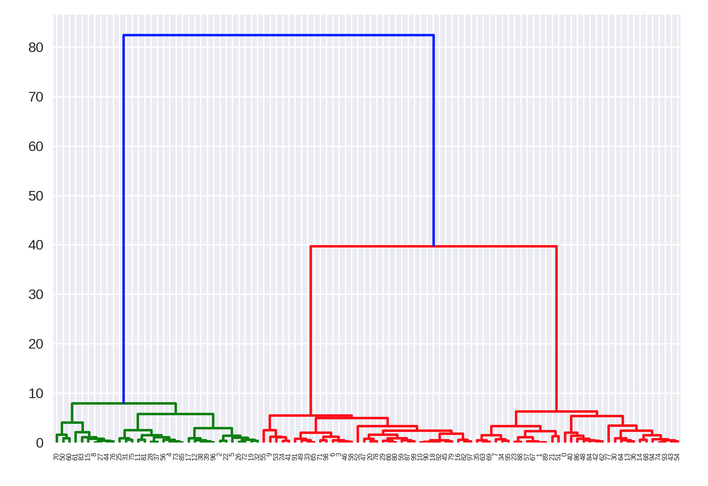
More: https://joernhees.de/blog/2015/08/26/scipy-hierarchical-clustering-and-dendrogram-tutorial/
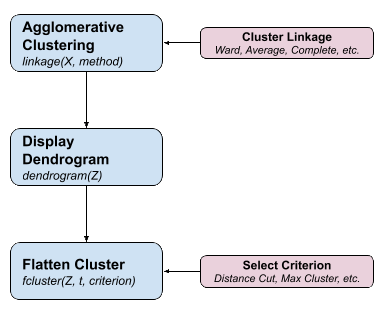
In essence, we can also use the 3-step method above to compute agglomerative clustering.
from scipy.cluster.hierarchy import linkage, dendrogram, fcluster

# 1. clustering
Z = linkage(X, method='ward', metric='euclidean')

# 2. draw dendrogram
plt.figure(figsize=(10,5));
dendrogram(Z, orientation='left', leaf_font_size=8)
plt.show()

# 3. flatten cluster
distance_threshold = 10
y = fcluster(Z, distance_threshold, criterion='distance')
sklearn agglomerative clustering is very slow, and an alternative fastcluster library
performs much faster as it is a C++ library with a python interface.
More: https://pypi.org/project/fastcluster/
import fastcluster
from scipy.cluster.hierarchy import dendrogram, fcluster

# 1. clustering
Z = fastcluster.linkage_vector(X, method='ward', metric='euclidean')
Z_df = pd.DataFrame(data=Z, columns=['clusterOne','clusterTwo','distance','newClusterSize'])

# 2. draw dendrogram
plt.figure(figsize=(10, 5))
dendrogram(Z, orientation='left', leaf_font_size=8)
plt.show();

# 3. flatten cluster
distance_threshold = 2000
clusters = fcluster(Z, distance_threshold, criterion='distance')
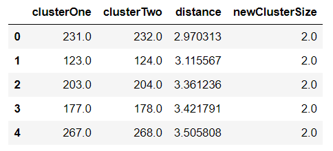
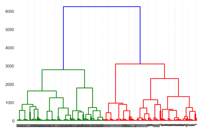
Then we select the distance threshold to cut the dendrogram to obtain the selected clustering level. The output is the cluster labelled for each row of data. As expected from the dendrogram, a cut at 2000 gives us 5 clusters.
This link gives an excellent tutorial on prettifying the dendrogram. http://datanongrata.com/2019/04/27/67/
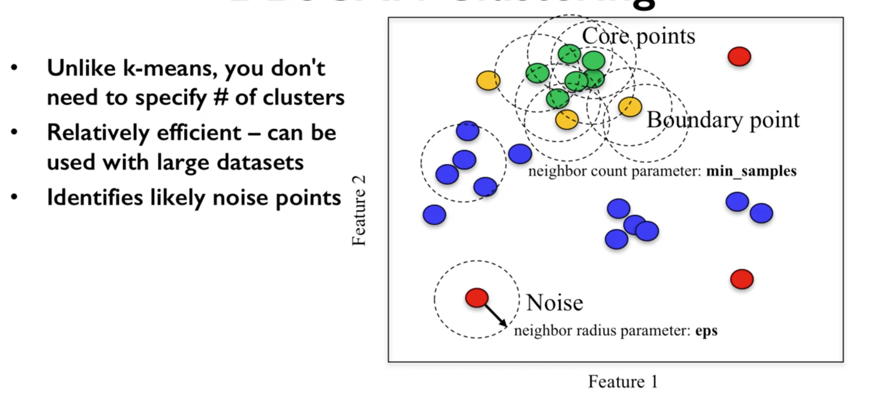
10.2.4. DBSCAN
Density-Based Spatial Clustering of Applications with Noise (DBSCAN). Need to scale/normalise data. DBSCAN works by identifying crowded regions referred to as dense regions.
Key parameters are eps and min_samples.
If there are at least min_samples many data points within a distance of eps
to a given data point, that point will be classified as a core sample.
Core samples that are closer to each other than the distance eps are put into
the same cluster by DBSCAN.
There is recently a new method called HDBSCAN (H = Hierarchical). https://hdbscan.readthedocs.io/en/latest/index.html

Introduction to Machine Learning with Python
- Methodology
- Pick an arbitrary point to start
- Find all points with distance eps or less from that point
- If points are more than min_samples within distance of esp, point is labelled as a core sample, and assigned a new cluster label
- Then all neighbours within eps of the point are visited
- If they are core samples their neighbours are visited in turn and so on
- The cluster thus grows till there are no more core samples within distance eps of the cluster
- Then, another point that has not been visited is picked, and step 1-6 is repeated
- 3 kinds of points are generated in the end, core points, boundary points, and noise
- Boundary points are core clusters but not within distance of esp
University of Michigan: Coursera Data Science in Python
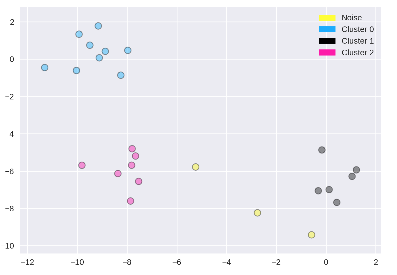
from sklearn.cluster import DBSCAN
from sklearn.datasets import make_blobs

X, y = make_blobs(random_state = 9, n_samples = 25)

dbscan = DBSCAN(eps = 2, min_samples = 2)

cls = dbscan.fit_predict(X)
print("Cluster membership values:\n{}".format(cls))
Cluster membership values:
    [ 0  1  0  2  0  0  0  2  2 -1  1  2  0  0 -1  0  0  1 -1  1  1  2  2  2  1]
    # -1 indicates noise or outliers

plot_labelled_scatter(X, cls + 1,
        ['Noise', 'Cluster 0', 'Cluster 1', 'Cluster 2'])
10.3. One-Class Classification
These requires the training of a normal state(s), allows outliers to be detected when they lie outside trained state.
10.3.1. One Class SVM
One-class SVM is an unsupervised algorithm that learns a decision function for outlier detection: classifying new data as similar or different to the training set.
Besides the kernel, two other parameters are impt: The nu parameter should be the proportion of outliers you expect to observe (in our case around 2%), the gamma parameter determines the smoothing of the contour lines.
from sklearn.svm import OneClassSVM

train, test = train_test_split(data, test_size=.2)
train_normal = train[train['y']==0]
train_outliers = train[train['y']==1]
outlier_prop = len(train_outliers) / len(train_normal)

model = OneClassSVM(kernel='rbf', nu=outlier_prop, gamma=0.000001)
svm.fit(train_normal[['x1','x4','x5']])
10.3.2. Isolation Forest
from sklearn.ensemble import IsolationForest

clf = IsolationForest(behaviour='new', max_samples=100,
                    random_state=rng, contamination='auto')

clf.fit(X_train)
y_pred_test = clf.predict(X_test)

# -1 are outliers
y_pred_test
# array([ 1,  1,  1,  1,  1,  1,  1,  1,  1, -1,  1,  1,  1,  1,  1,  1])

# calculate the no. of anomalies
pd.DataFrame(save)[0].value_counts()
# -1    23330
# 1      687
# Name: 0, dtype: int64
We can also get the average anomaly scores. The lower, the more abnormal. Negative scores represent outliers, positive scores represent inliers.
clf.decision_function(X_test)
array([ 0.14528263,  0.14528263, -0.08450298,  0.14528263,  0.14528263,
      0.14528263,  0.14528263,  0.14528263,  0.14528263, -0.14279962,
      0.14528263,  0.14528263, -0.05483886, -0.10086102,  0.14528263,
      0.14528263])
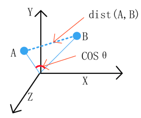
10.4. Distance Metrics
10.4.1. Euclidean Distance & Cosine Similarity
Euclidean distance is the straight line distance between points, while cosine distance is the cosine of the angle between these two points.
from scipy.spatial.distance import euclidean

euclidean([1,2],[1,3])
# 1
from scipy.spatial.distance import cosine

cosine([1,2],[1,3])
# 0.010050506338833642
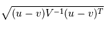
10.4.2. Mahalanobis Distance
Mahalonobis distance is the distance between a point and a distribution, not between two distinct points. Therefore, it is effectively a multivariate equivalent of the Euclidean distance.
https://www.machinelearningplus.com/statistics/mahalanobis-distance/
x: is the vector of the observation (row in a dataset),m: is the vector of mean values of independent variables (mean of each column),C^(-1): is the inverse covariance matrix of independent variables.
Multiplying by the inverse covariance (correlation) matrix essentially means dividing the input with the matrix. This is so that if features in your dataset are strongly correlated, the covariance will be high. Dividing by a large covariance will effectively reduce the distance.
While powerful, its use of correlation can be detrimantal when there is multicollinearity (strong correlations among features).
import pandas as pd
import numpy as np
from scipy.spatial.distance import mahalanobis

def mahalanobisD(normal_df, y_df):
    # calculate inverse covariance from normal state
    x_cov = normal_df.cov()
    inv_cov = np.linalg.pinv(x_cov)

    # get mean of normal state df
    x_mean = normal_df.mean()

    # calculate mahalanobis distance from each row of y_df
    distanceMD = []
    for i in range(len(y_df)):
        MD = mahalanobis(x_mean, y_df.iloc[i], inv_cov)
        distanceMD.append(MD)

    return distanceMD
10.4.3. Dynamic Time Warping
If two time series are identical, but one is shifted slightly along the time axis, then Euclidean distance may consider them to be very different from each other. DTW was introduced to overcome this limitation and give intuitive distance measurements between time series by ignoring both global and local shifts in the time dimension.
DTW is a technique that finds the optimal alignment between two time series, if one time series may be “warped” non-linearly by stretching or shrinking it along its time axis. Dynamic time warping is often used in speech recognition to determine if two waveforms represent the same spoken phrase. In a speech waveform, the duration of each spoken sound and the interval between sounds are permitted to vary, but the overall speech waveforms must be similar.
From the creators of FastDTW, it produces an accurate minimum-distance warp path between two time series than is nearly optimal (standard DTW is optimal, but has a quadratic time and space complexity).
Output: Identical = 0, Difference > 0
import numpy as np
from scipy.spatial.distance import euclidean
from fastdtw import fastdtw

x = np.array([[1,1], [2,2], [3,3], [4,4], [5,5]])
y = np.array([[2,2], [3,3], [4,4]])
distance, path = fastdtw(x, y, dist=euclidean)
print(distance)

# 2.8284271247461903
https://dtaidistance.readthedocs.io/en/latest/index.html is a dedicated package that gives more options to the traditional DTW, especially the visualisation aspects.
Stan Salvador & Philip ChanFast. DTW: Toward Accurate Dynamic Time Warping in Linear Time and Space. Florida Institude of Technology. https://cs.fit.edu/~pkc/papers/tdm04.pdf
10.4.4. Symbolic Aggregate approXimation
SAX, developed in 2007, compares the similarity of two time-series patterns by slicing them into horizontal & vertical regions, and comparing between each of them. This can be easily explained by 4 charts provided by https://jmotif.github.io/sax-vsm_site/morea/algorithm/SAX.html.
There are obvious benefits using such an algorithm, for one, it will be very fast as pattern matching is aggregated. However, the biggest downside is that both time-series signals have to be of same time-length.
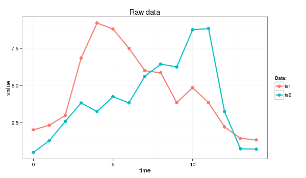
Both signals are overlayed.
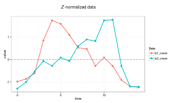
Then normalised.
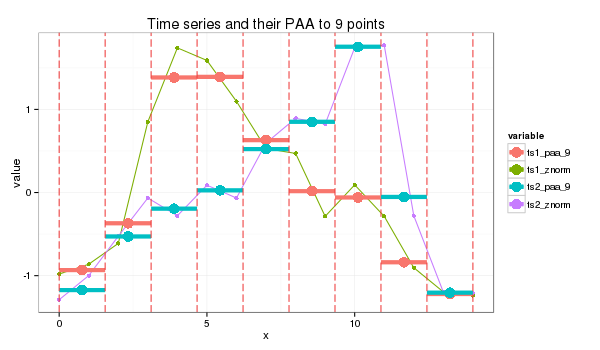
The chart is then sliced by various timeframes, Piecewise Aggregate Approximation, and each slice is compared between the two signals independently.
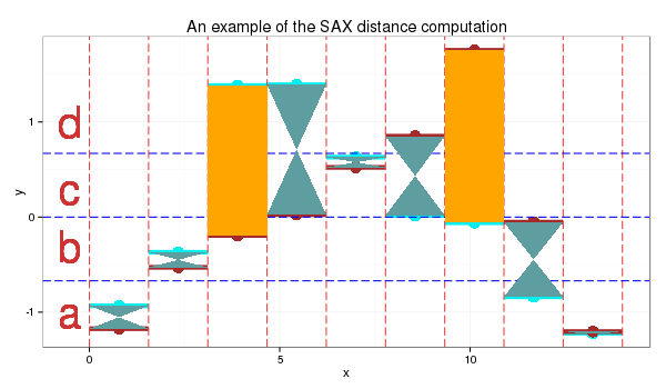
Each signal value, i.e., y-axis is then sliced horizontally into regions, and assigned an alphabet.
Lastly, we use a distance scoring metric, through a fixed lookup table to easily calculate the total scores between each pair of PAA.
E.g., if the PAA fall in a region or its immediate adjacent one, we assume they are the same, i.e., distance = 0. Else, a distance value is assigned. The total distance is then computed to derice a distance metric.
- For this instance:
- SAX transform of ts1 into string through 9-points PAA: “abddccbaa”
- SAX transform of ts2 into string through 9-points PAA: “abbccddba”
- SAX distance: 0 + 0 + 0.67 + 0 + 0 + 0 + 0.67 + 0 + 0 = 1.34
This is the code from the package saxpy. Unfortunately, it does not have the option of calculating of the sax distance.
import numpy as np
from saxpy.znorm import znorm
from saxpy.paa import paa
from saxpy.sax import ts_to_string
from saxpy.alphabet import cuts_for_asize

def saxpy_sax(signal, paa_segments=3, alphabet_size=3):
  sig_znorm = znorm(signal)
  sig_paa = paa(sig_znorm, paa_segments)
  sax = ts_to_string(sig_paa, cuts_for_asize(alphabet_size))
  return sax

sig1a = saxpy_sax(sig1)
sig2a = saxpy_sax(sig2)
Another more mature package is tslearn. It enables the calculation of sax distance, but the sax alphabets are set as integers instead.
from tslearn.piecewise import SymbolicAggregateApproximation

def tslearn_sax(sig1, sig2, n_segments, alphabet_size):

  # Z-transform, PAA & SAX transformation
  sax = SymbolicAggregateApproximation(n_segments=n_segments, alphabet_size_avg=alphabet_size)
  sax_data = sax.fit_transform([sig1_n,sig2_n])

  # distance measure
  distance = sax.distance_sax(sax_data[0],sax_data[1])

  return sax_data, distance

# [[[0]
#   [3]
#   [3]
#   [1]]

#  [[0]
#   [1]
#   [2]
#   [3]]]

# 1.8471662549420924
The paper: https://cs.gmu.edu/~jessica/SAX_DAMI_preprint.pdf