3. Exploratory Analysis
Exploratory data analysis (EDA) is an essential step to understand the data better; in order to engineer and select features before modelling. This often requires skills in visualisation to better interpret the data.
3.1. Univariate
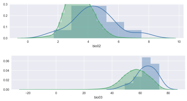
3.1.1. Distribution Plots
When plotting distributions, it is important to compare the distribution of both train and test sets. If the test set very specific to certain features, the model will underfit and have a low accuarcy.
import seaborn as sns
import matplotlib.pyplot as plt
%config InlineBackend.figure_format = 'retina'
%matplotlib inline

for i in X.columns:
    plt.figure(figsize=(15,5))
    sns.distplot(X[i])
    sns.distplot(pred[i])
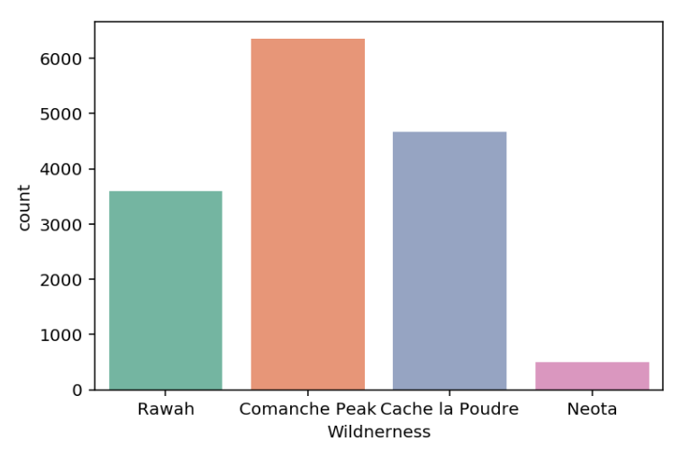
3.1.2. Count Plots
For categorical features, you may want to see if they have enough sample size for each category.
import seaborn as sns
import matplotlib.pyplot as plt
%config InlineBackend.figure_format = 'retina'
%matplotlib inline

df['Wildnerness'].value_counts()

Comanche Peak      6349
Cache la Poudre    4675
Rawah              3597
Neota               499
Name: Wildnerness, dtype: int64

cmap = sns.color_palette("Set2")
sns.countplot(x='Wildnerness',data=df, palette=cmap);
plt.xticks(rotation=45);
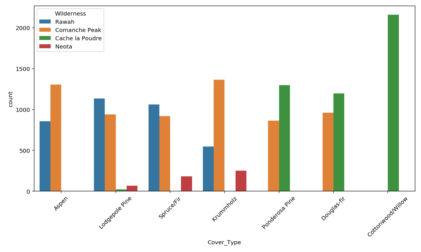
To check for possible relationships with the target, place the feature under hue.
plt.figure(figsize=(12,6))
sns.countplot(x='Cover_Type',data=wild, hue='Wilderness');
plt.xticks(rotation=45);
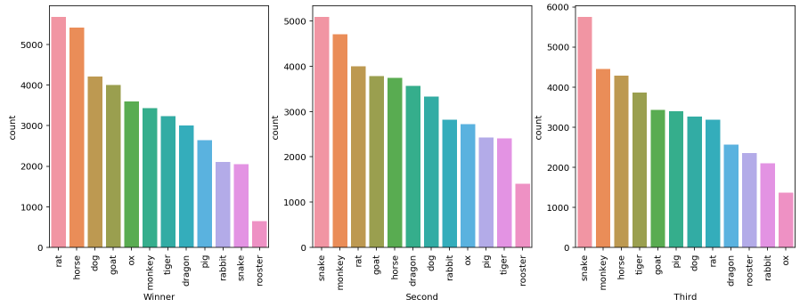
Multiple Plots
fig, axes = plt.subplots(ncols=3, nrows=1, figsize=(15, 5)) # note only for 1 row or 1 col, else need to flatten nested list in axes
col = ['Winner','Second','Third']

for cnt, ax in enumerate(axes):
    sns.countplot(x=col[cnt], data=df2, ax=ax, order=df2[col[cnt]].value_counts().index);

for ax in fig.axes:
    plt.sca(ax)
    plt.xticks(rotation=90)
3.1.3. Box Plots
Using the 50 percentile to compare among different classes, it is easy to find feature that can have high prediction importance if they do not overlap. Also can be use for outlier detection. Features have to be continuous.
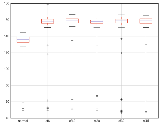
From different dataframes, displaying the same feature.
df = pd.DataFrame({'normal': normal['Pressure'], 's1': cf6['Pressure'], 's2': cf12['Pressure'],
                    's3': cf20['Pressure'], 's4': cf30['Pressure'],'s5': cf45['Pressure']})
df.boxplot(figsize=(10,5));
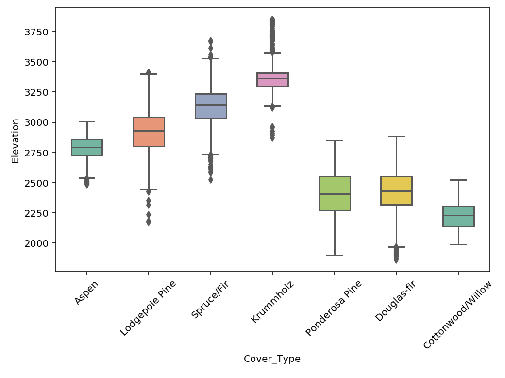
From same dataframe with of a feature split by different y-labels
plt.figure(figsize=(7, 5))
cmap = sns.color_palette("Set3")
sns.boxplot(x='Cover_Type', y='Elevation', data=df, palette=cmap);
plt.xticks(rotation=45);
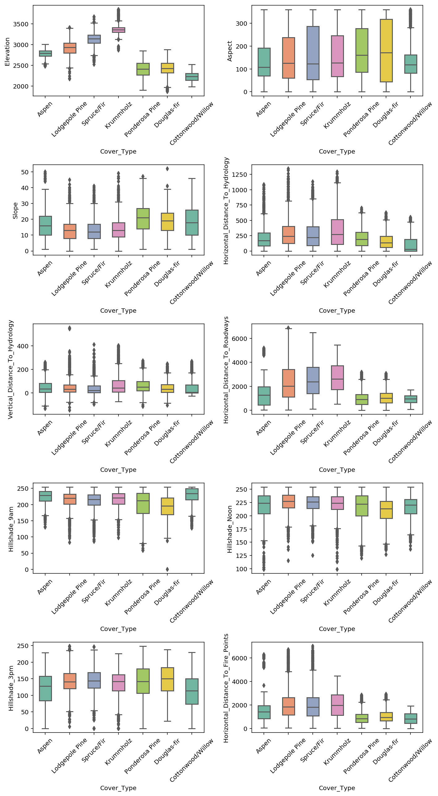
Multiple Plots
cmap = sns.color_palette("Set2")

fig, axes = plt.subplots(ncols=2, nrows=5, figsize=(10, 18))
a = [i for i in axes for i in i] # axes is nested if >1 row & >1 col, need to flatten
for i, ax in enumerate(a):
    sns.boxplot(x='Cover_Type', y=eda2.columns[i], data=eda, palette=cmap, width=0.5, ax=ax);

# rotate x-axis for every single plot
for ax in fig.axes:
    plt.sca(ax)
    plt.xticks(rotation=45)

# set spacing for every subplot, else x-axis will be covered
plt.tight_layout()
3.2. Multi-Variate
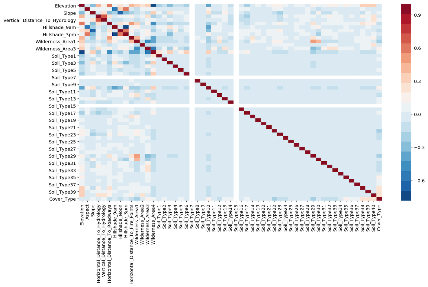
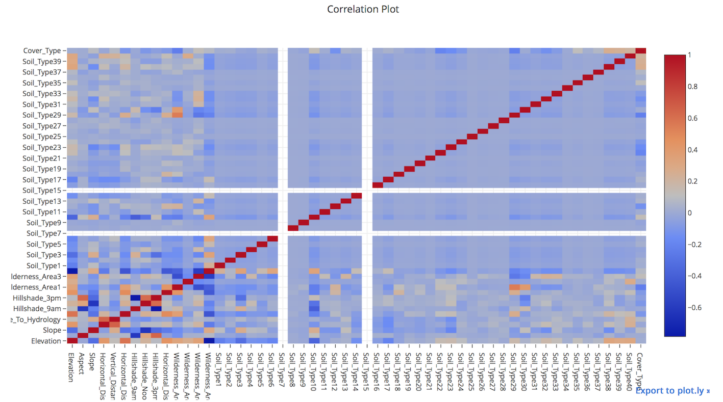
3.2.1. Correlation Plots
Heatmaps show a quick overall correlation between features.
Using plot.ly
from plotly.offline import iplot
from plotly.offline import init_notebook_mode
import plotly.graph_objs as go
init_notebook_mode(connected=True)

# create correlation in dataframe
corr = df[df.columns[1:]].corr()

layout = go.Layout(width=1000, height=600, \
                title='Correlation Plot', \
                font=dict(size=10))
data = go.Heatmap(z=corr.values, x=corr.columns, y=corr.columns)
fig = go.Figure(data=[data], layout=layout)
iplot(fig)
Using seaborn
import seaborn as sns
import matplotlib.pyplot as plt
%config InlineBackend.figure_format = 'retina'
%matplotlib inline

# create correlation in dataframe
corr = df[df.columns[1:]].corr()

plt.figure(figsize=(15, 8))
sns.heatmap(corr, cmap=sns.color_palette("RdBu_r", 20));